Steward’s Corner: Secrets of a Successful Flyer
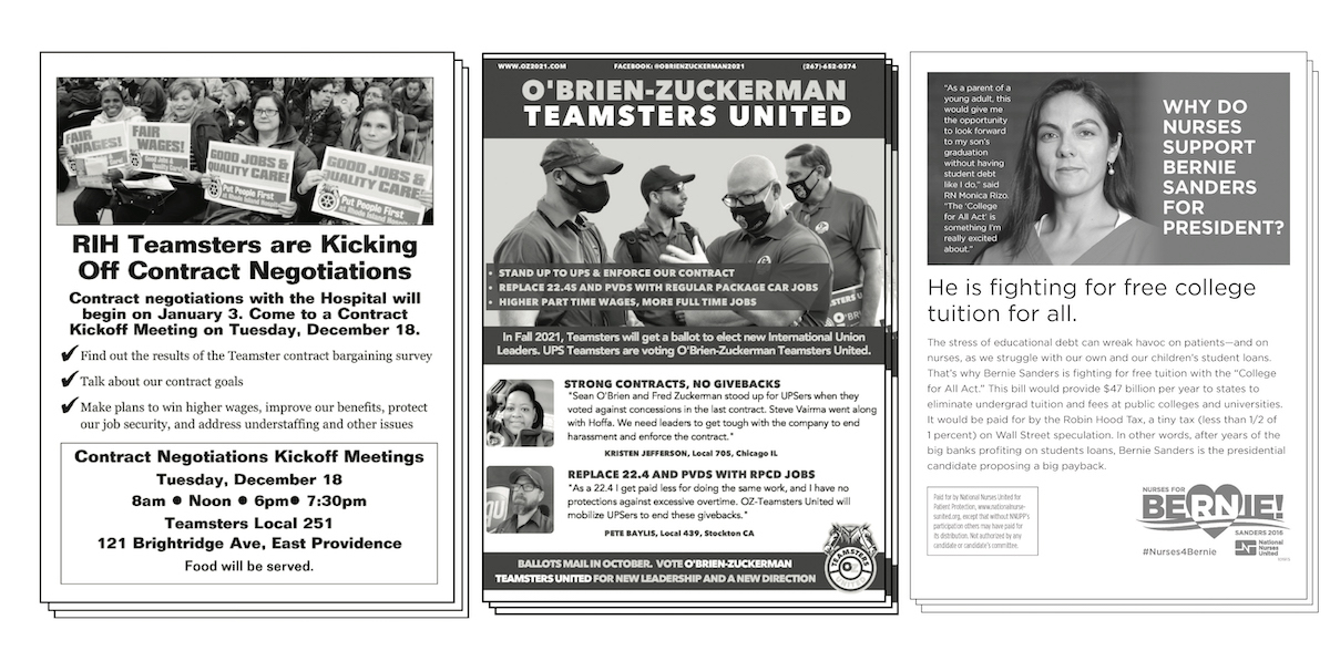
Do these flyers all have strong visuals, descriptive headlines, short text, and clear calls to action? What changes would you make to improve them? Flyers courtesy of Teamsters Local 251, the Teamsters United slate, and National Nurses United.
It was a snowy morning in 2002, I was a brand-new shop steward in CWA Local 3372 in Lexington, Kentucky, and I had volunteered to hand out the flyers for our contract campaign.
I handed out 200 copies, then headed in to my shift at a Verizon 411 call center. When I passed the garbage can, I saw most of my flyers—wadded up and thrown away.
In the two decades since, many unions have turned to email, texting, and social media to reach members. That’s a serious mistake.
The humble black-and-white workplace flyer is still our most direct way to talk to our co-workers about why the boss is wrong and what we’re going to do to make the situation better.
Since that day, I’ve made and distributed hundreds more flyers. Here are some lessons I’ve learned along the way.
Your flyer will end up in the trash—so you only have a few moments to get across your most important ideas.
Use longer, descriptive headlines to get to the point right away. It’s better to say something like “Protect Our Benefits -- Vote Yes to Authorize a Strike” than to write a short, cute headline. Remember, your flyer is going to end up in the trash.
Talk to people. The point of a flyer is to start organizing conversations with our co-workers. A good flyer will give other members of your team the talking points they need to have those conversations—and an excuse to go have them. If you have a petition for people to sign, or something else to do, even better.
Keep it short. Here’s a rule of thumb: no paragraph should be longer than four lines long. Not four sentences—four lines. And don’t use more than two or three paragraphs.
Teach your co-workers how to pass out a flyer. Many new activists are too shy and will want to just put flyers on bulletin boards or on the car windshields in the parking lot. Use flyer distribution to show new leaders how to have effective organizing conversations.
Use pictures and quotes from members. A direct quote from a popular shop-floor leader can be more powerful than just regular text. You can even use quotes for headlines.
Every flyer needs anger, hope, urgency, and you (AHUY): Anger at what the boss is doing. Hope that we can make change as a union. Urgency to take action now. And what we’re asking each member of our union to do.
There are five basic design elements to every flyer:
- A descriptive headline
- One strong visual
- Very short text
- A “call to action” (what you want members to do)
- Who we are and how to find us
Avoid vague calls to action. Chances are, most of your co-workers don’t want to “join us”—or even worse, “get involved.” Who has the time these days to “get involved?” But your co-workers may sign a petition, march on the boss, share the flyer, take a survey, or join a picket. Be specific about what we’re asking them to do.
Make sure there is white space. Keep plenty of blank space in the margin and around and between your paragraphs and image. White space makes your flyer easier to read. The best way to add white space is to keep your flyer short.

Break up your text. Use bullets, numbered points, or check marks to break up the text and increase white space.
Don’t speculate. Only write down what you can back up. As rank-and-file activists, our credibility is valuable—protect it.
Have someone else read it first. You know how they make two people turn the key to launch the nuclear missile? Treat your flyer like that and make sure someone else reads it before it goes out.
Proofread backwards. You will catch more typos if you read the flyer backward. Try it and see.
Avoid all caps. ALL CAPS MAKE YOU SOUND A LITTLE OFF.
Don’t use more than two fonts. Use one font for headlines and one font for your body text. Serif fonts—fonts with the little squiggly bits at the end of each letter—are easier to read.
Will it photocopy? Make sure your photo is black-and-white and avoid large dark areas. Many of us have to make copies using copy machines we’re not supposed to use.
Avoid quarter and half-sheet flyers. Do you really want to do all that cutting? (If you absolutely have to have a small flyer, fold it instead. Legendary Teamster President Ron Carey used to hand-fold his flyers so that drivers would put them in their pockets. Make sure to fold them with the headline facing out.)
You’re not as funny as you think you are. It’s better to be direct and serious than have your joke bomb.
Your flyer does not need to be beautiful, but it should be clean. The best way to keep your flyer clean: follow the rules here.
Dan Lutz is a staffer at the New York State Nurses Association.


You must log in or register to post a comment.